Natural Health / Brand Identity / Product Labels
EDEN'S CURE
From kitchen table to retail shelf.
From kitchen table to retail shelf.
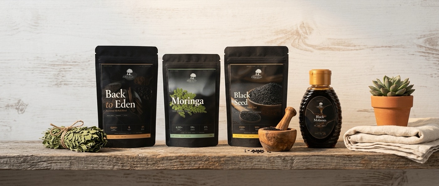
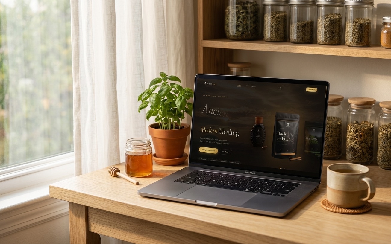
Eden's Cure makes herbal supplements the old way - small batches, traditional recipes, real ingredients. Back to Eden, Moringa, Black Seed, Molasses. Four products born from ancient knowledge. But the brand lived in handwritten labels and word-of-mouth. To reach retail shelves and new customers, they needed a complete identity - from logo to label to website to video - that honoured the earth-rooted philosophy while commanding shelf presence.
The full collection. Four ancient remedies, each with front and back label designs, QR codes linking to individual product pages. Print-ready at 300dpi with bleed and crop marks.
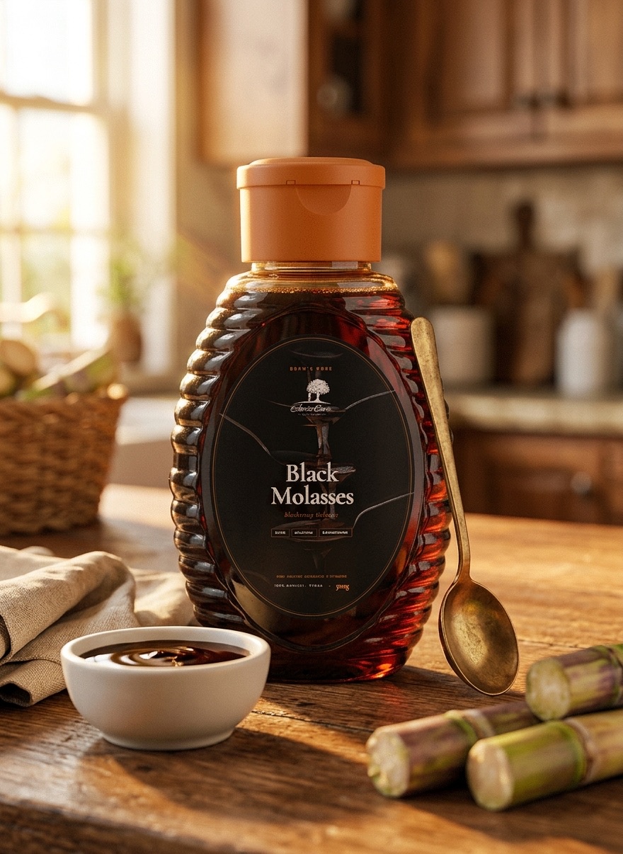
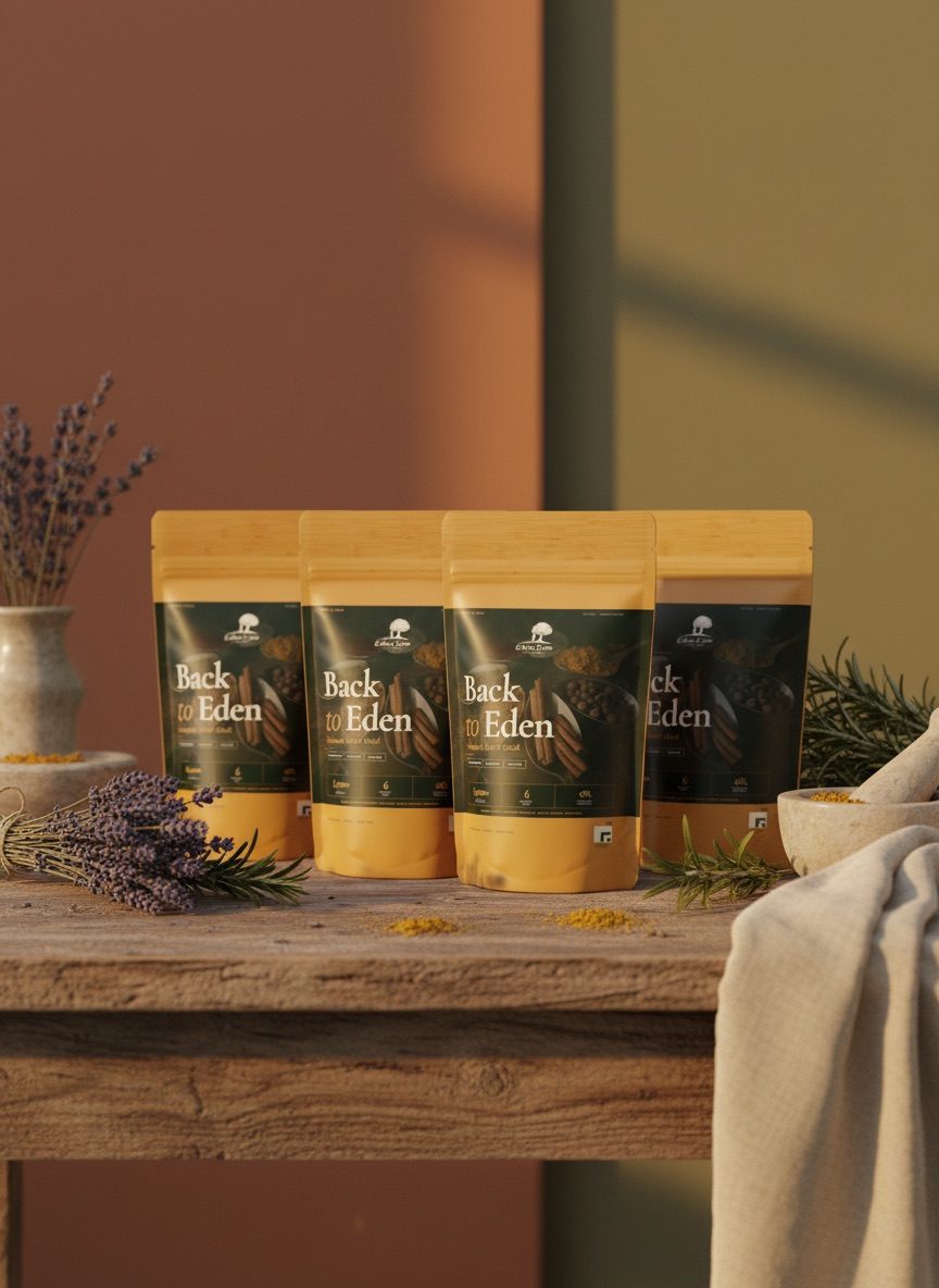
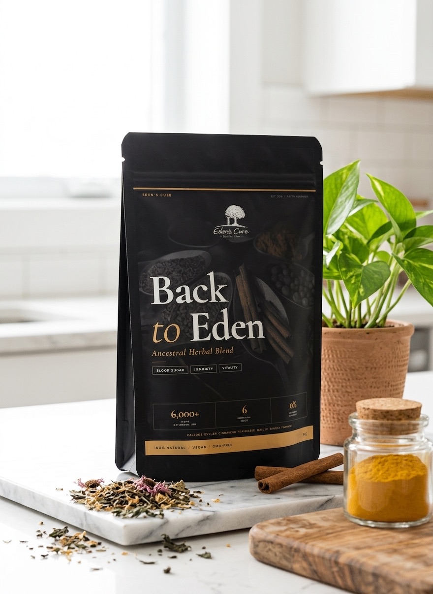
Each product received its own front and back label design, iterated through three rounds. QR codes on every bottle link to dedicated product pages on the website.
Colour palette rooted in earth: Forest Green as the anchor. Warm Gold for premium accents. Cream for breathing room. Every colour chosen to evoke nature, tradition, and trust.
A full e-commerce website with homepage, shop, catalogue, individual product pages, and about section. Two complete themes - a rich dark mode for evening browsing and a clean light mode for daytime.
Typography pairing: Cormorant Garamond for elegant serif headings and DM Sans for clean body text. The serif brings heritage. The sans brings modernity.
" Four ancient remedies. Preserved in their purest form.
Let us take your product from concept to shelf with a brand identity people remember.
Start Your Project