Editorial / PR Magazine / Mpumalanga
PEGNEWSLETTER
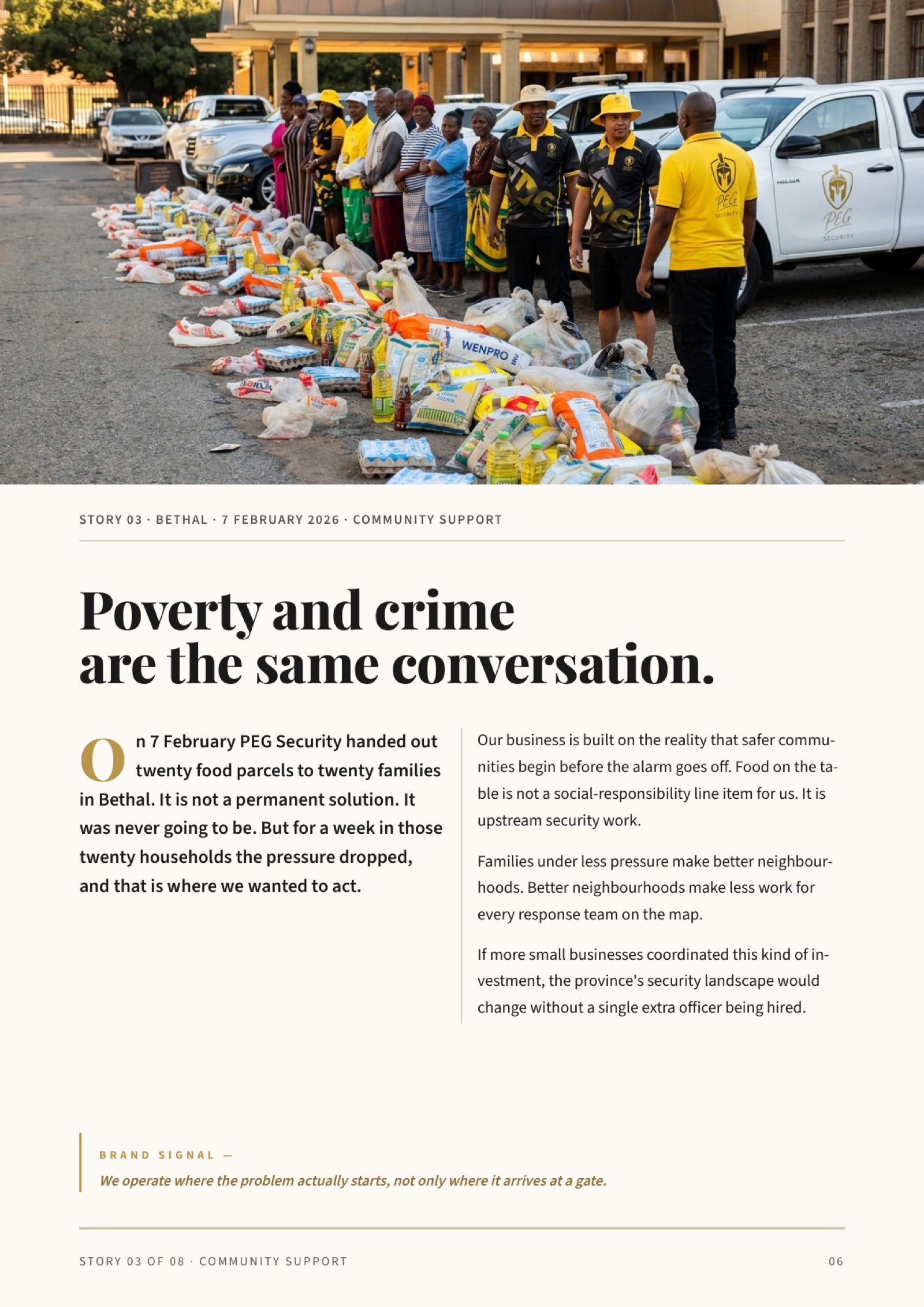
Ninety days of community work, told as a magazine, not a scrapbook.
Ninety days of community work, told as a magazine, not a scrapbook.
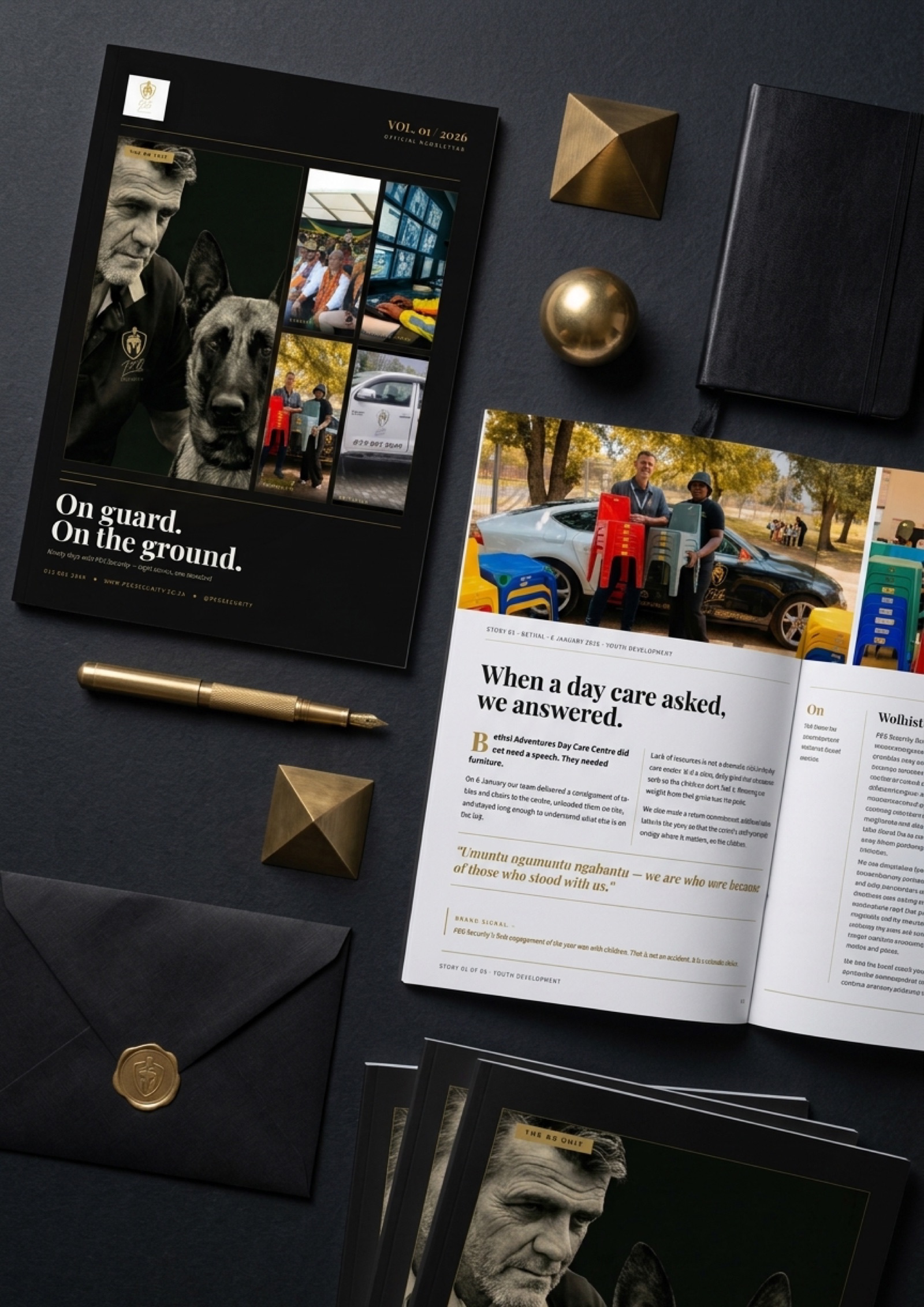
PEG Security handed us a draft newsletter that read as a scrapbook - eight community events listed in date order, with typos, awkward phrasing, and a template aesthetic. The brief was to turn the same source material into a quarterly PR document that could sit on a prospect's desk, be handed to a partner at a golf day, and be attached to an email without apology. Every story had to reposition as positioning evidence. Every image had to lift to editorial quality without losing the authenticity of real community work. The cover had to make a reader pause.
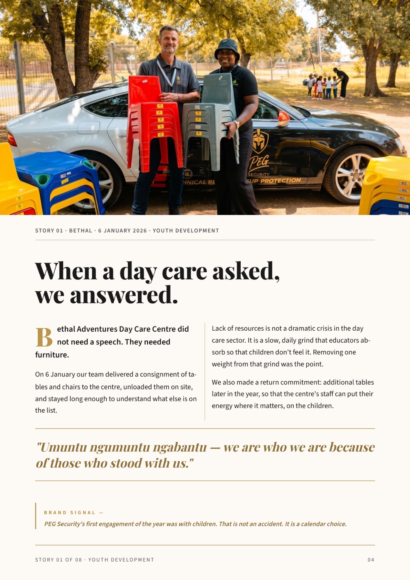
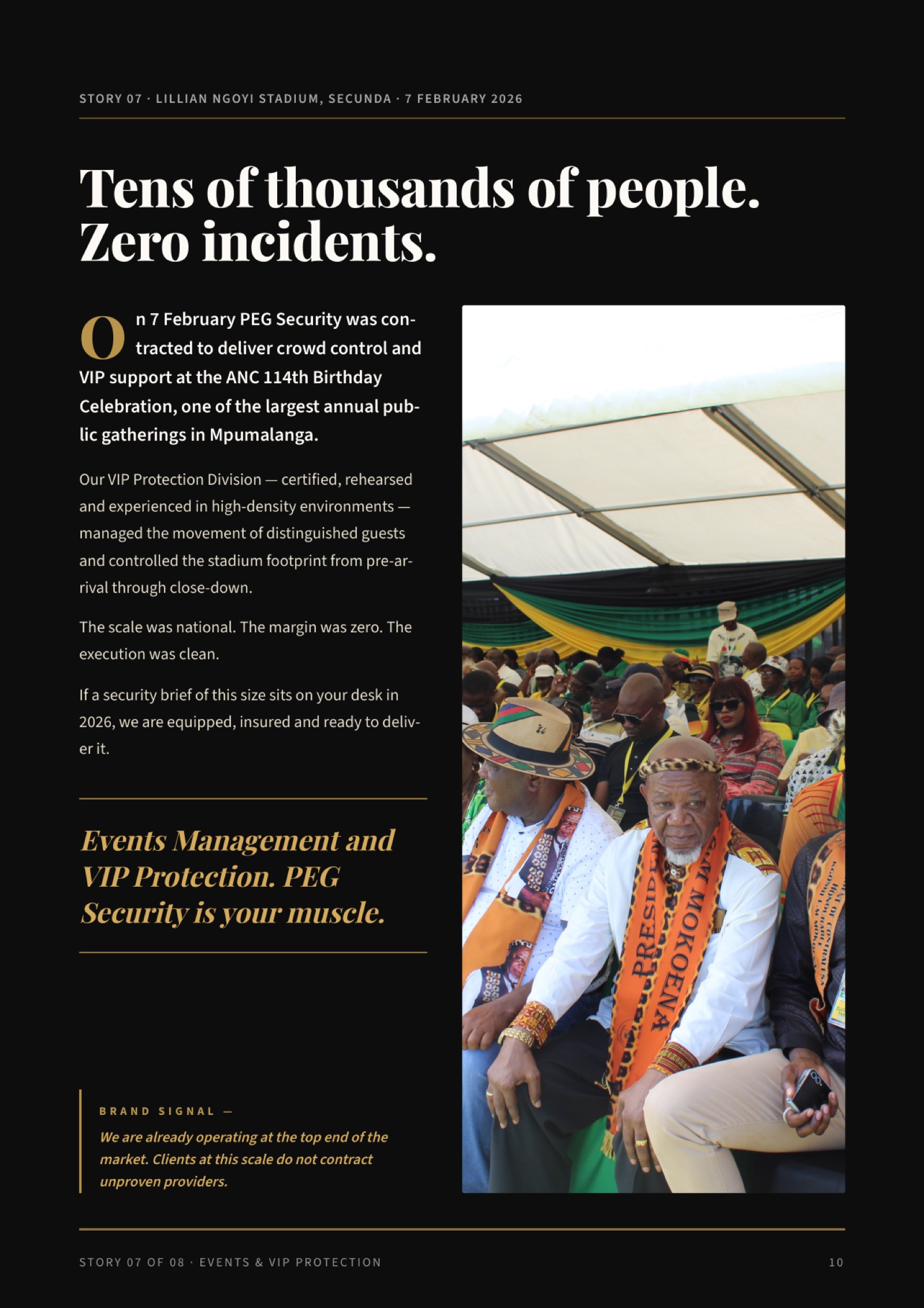
Eight stories. One arc. Children at a daycare, then learners with laptops, then families with food parcels, then operational staff training, then community presence, then schools, then a national-scale stadium event, then in-house culture. The issue tells one story about scale and discipline, using eight events to prove it.
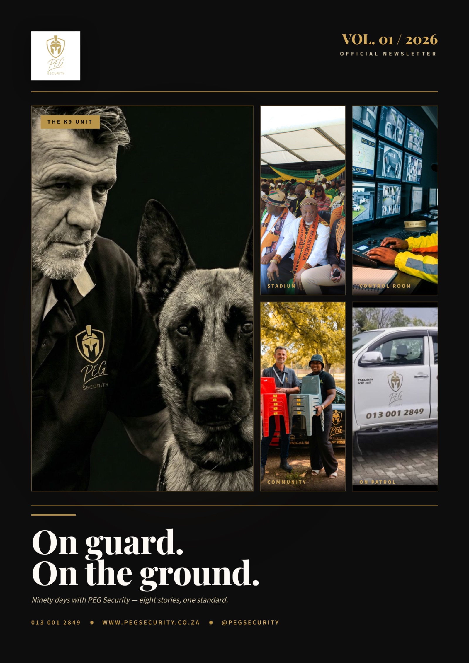
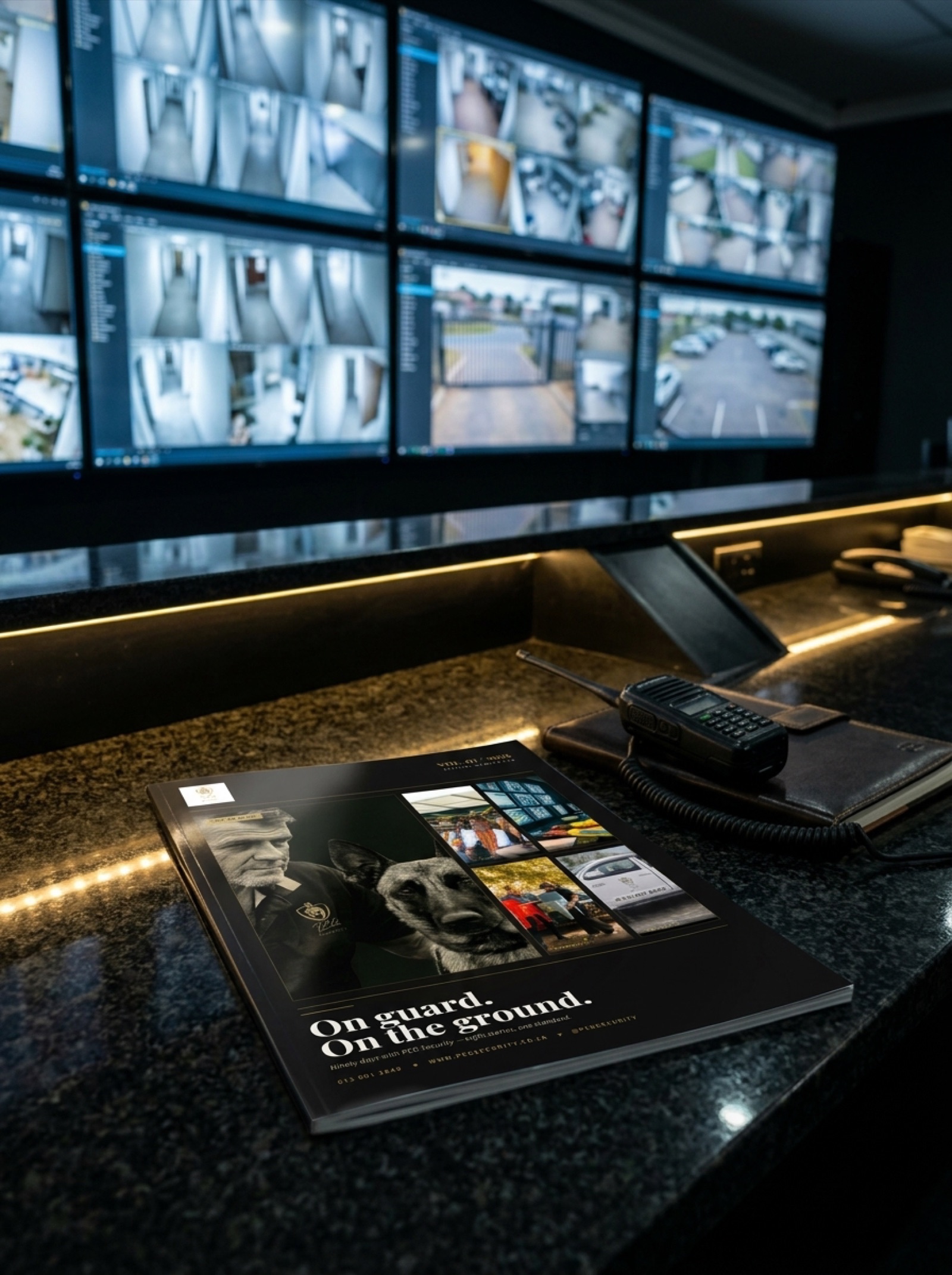
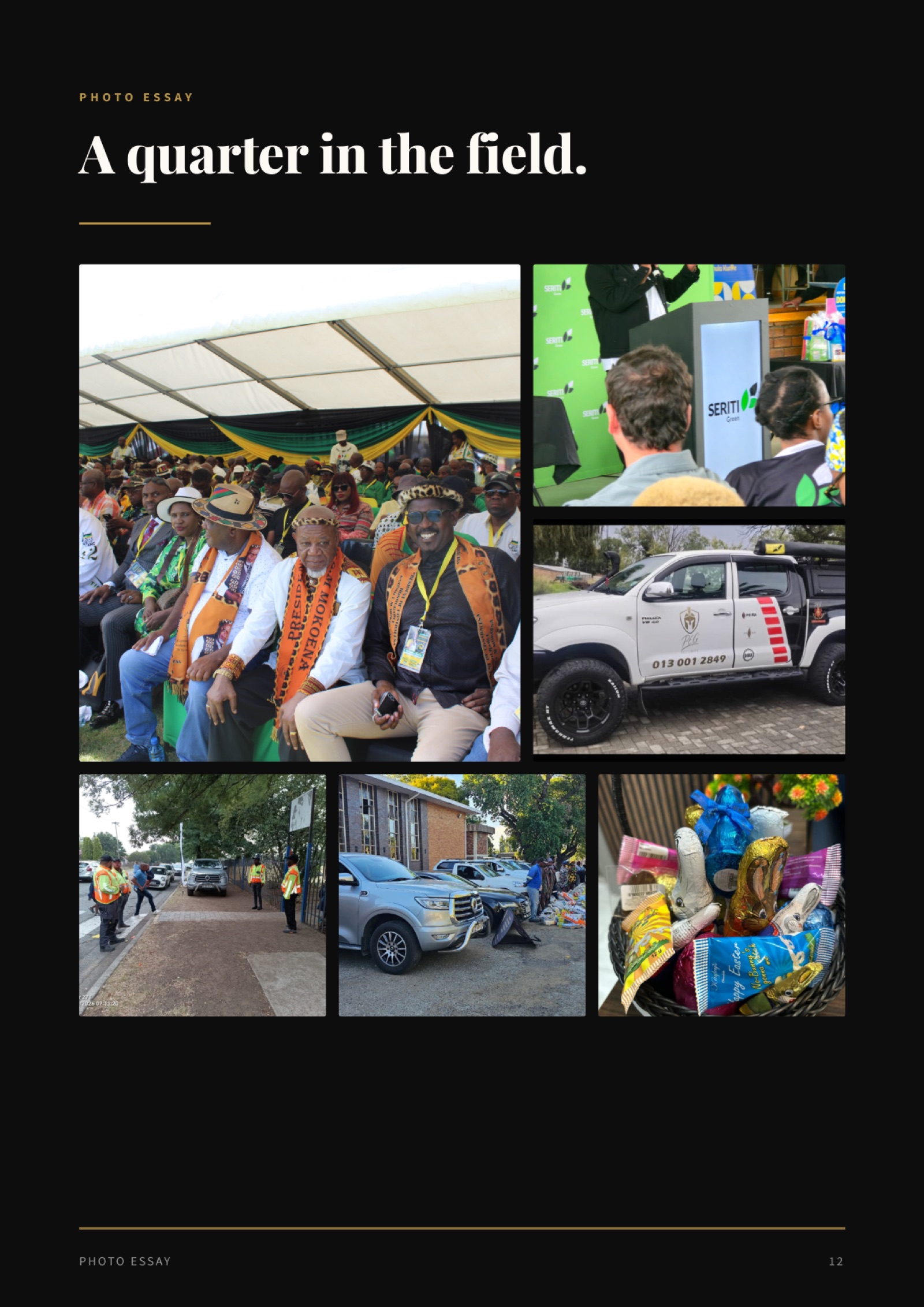
Rather than commission a hero shot or generate one, we composed the cover as an editorial photographic mosaic from five of the client's own event pictures. The K9 handler as the dominant hero, with inset panels showing the stadium crowd, the control room, a daycare delivery moment, and a PEG patrol vehicle.
Every face on the cover is a real person. Every location is a real site. Every detail is PEG's actual work. No stock, no synthesis, no compromise. A cover you can point at and say "that is us".
" Every story does three jobs at once: it tells a real event, it signals a brand value, it opens a commercial door.
A few of the spreads from the final book - editorial discipline, alternating cream and charcoal rhythm, Playfair Display headlines, Source Sans 3 body, and a signature gold Brand Signal callout closing every story.
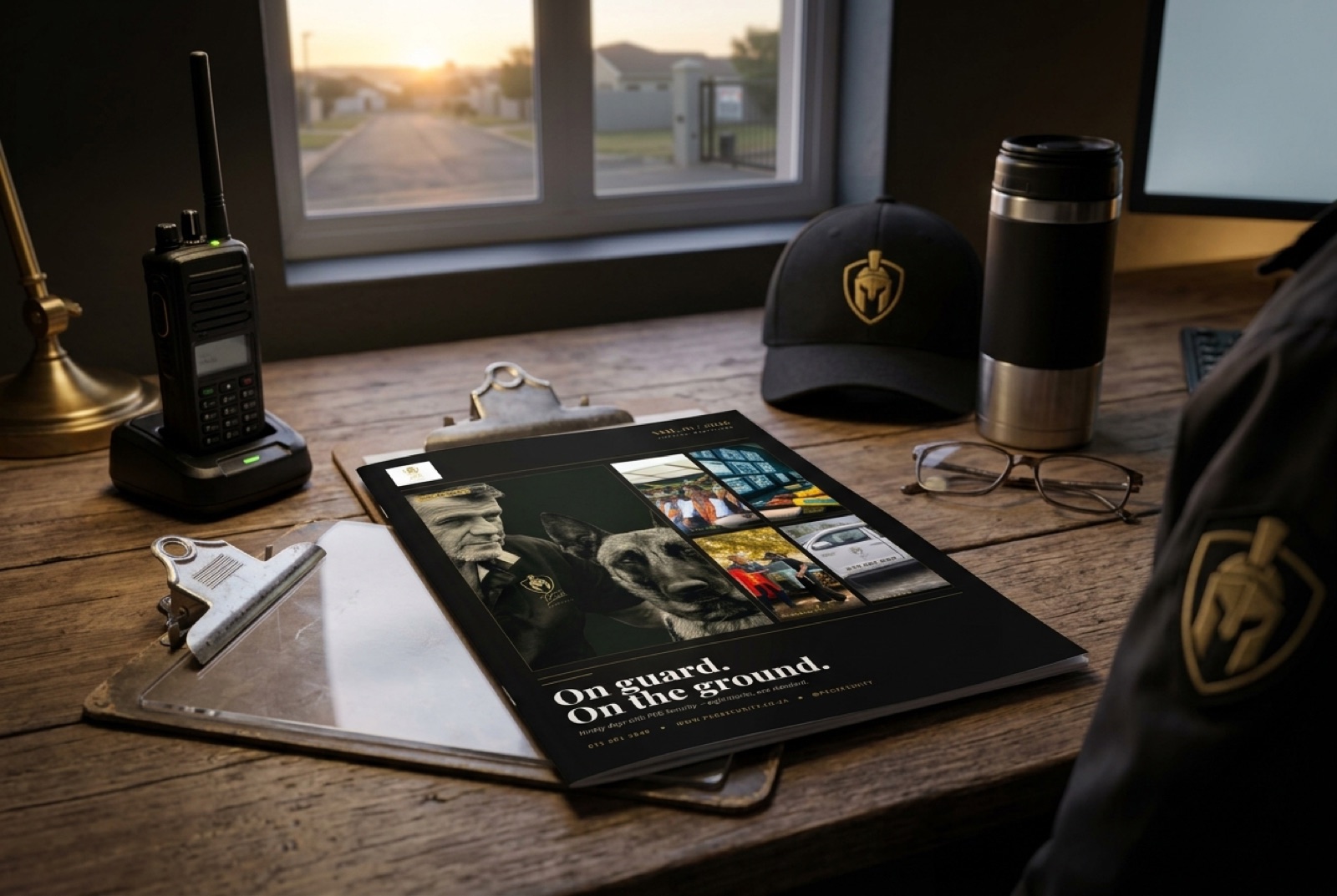
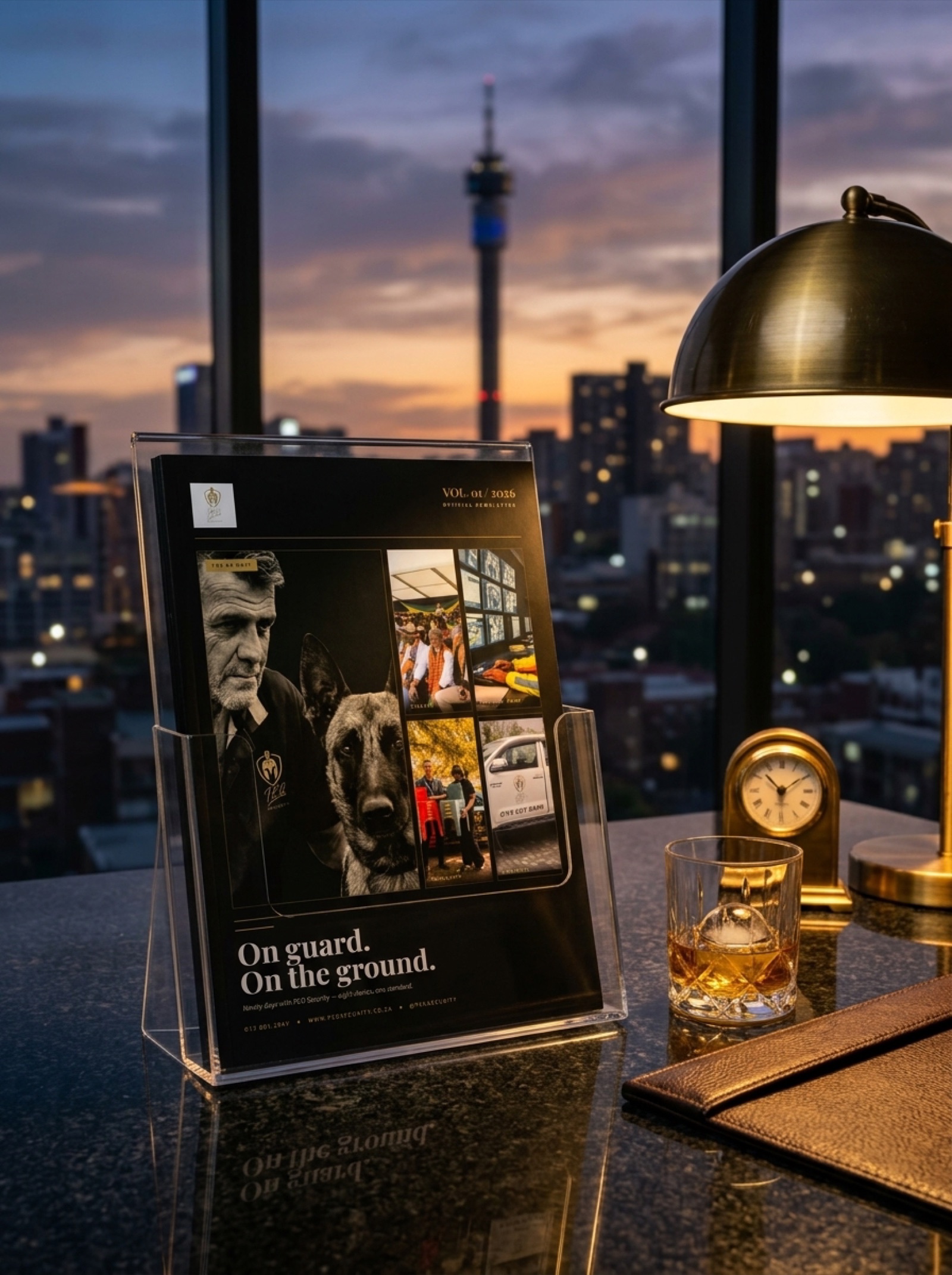
Designed to travel. The issue sits on the coffee table, fits in a prospect's hand, attaches to an email without compression concerns, and prints cleanly on a local press. One document, every delivery channel.
Every volume of this newsletter reuses the same editorial design system we built for Vol. 01. Playfair Display for headlines, Source Sans 3 for body, a cream and charcoal page rhythm, and the gold Brand Signal callout. Vol. 02 ships at half the design time.
Quarterly editorial that sells without asking for the sale.
Start Your Project